
Express Yourself Pediatric Therapy
Case Study: Designing an Accessible Brand for Pediatric Therapy
Creating a logo for a pediatric therapy business isn’t just about looking good—it’s about working hard for everyone who interacts with it. For this project, accessibility was at the heart of every design decision. From font choice to color contrast, every element was crafted to ensure clarity, readability, and emotional resonance across ages and abilities.
An accessible brand identity needs to do more than catch the eye—it needs to communicate clearly. That means using typefaces that are easy to read, color palettes that pass contrast checks, and symbols that feel both welcoming and empowering. For pediatric therapy, this also means striking the perfect balance: a design that feels playful enough to engage children, but professional and trustworthy for parents and caregivers.
In this case study, we’ll walk you through how we built a logo system that’s not only visually appealing but inclusive by design—because when a brand is truly accessible, it opens doors for connection, understanding, and growth.
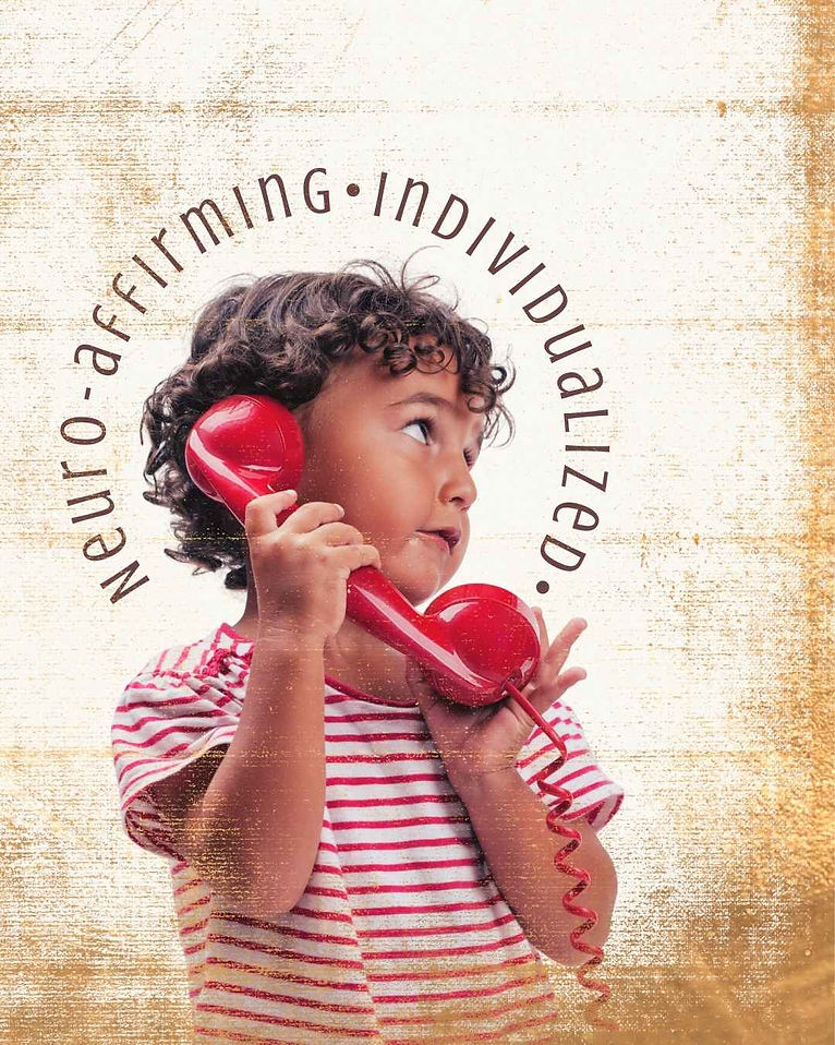
This branding suite blends simplicity with deep meaning. At its core, the design features three symbolic elements: the boho butterfly, a whimsical “x,” and a stylized infinity “S.” Each is clean, minimal, and intentionally crafted to represent transformation, growth, and limitless potential.
The butterfly evokes positive change and gentle strength. The “x” adds a touch of whimsy and curiosity—like a child exploring new possibilities. And the reimagined infinity symbol? It stands for continuous progress, hope, and the belief that every child can overcome challenges and develop new skills with the right support—whether in speech, motor development, or social interaction.
The typography is modern with a perfectly imperfect twist, subtly revealing the word self within the logo—an intentional nod to self-discovery and empowerment.
Project Scope: Rebrand, New Logo Identity
"I really LOVE the concept! I love the butterfly, infinity S, and the plant. I'm really getting excited! Thank you!" -Owner, Express Yourself Physical Therapy
%20(Presentation).jpg)

As part of the branding package, we also provide curated brand imagery suggestions—because visuals speak just as loudly as logos. These image guidelines help create a cohesive look and feel across platforms, reinforcing the brand’s message at every touchpoint. Whether it’s a dreamy, light-filled photo that mirrors the whimsical tone or imagery that highlights connection, support, and growth, we guide clients toward visuals that align seamlessly with the brand’s purpose. This not only strengthens recognition but builds emotional trust with the audience—making the brand feel consistent, intentional, and deeply human.

The suggested color palette strikes a beautiful balance: feminine yet strong, warm yet professional—resonating with both caregivers and clinicians alike.
Clean lines, legible text, and mindful contrast make this design not only beautiful but also accessible and inclusive—meeting today’s standards for clarity while still feeling magical.
The final brand board brings it all together—like the last puzzle piece that makes the picture click. It’s where the logo, color palette, typography, icons, and imagery come together in one cohesive visual story. This step is essential because it helps the client see the brand fully realized, not just in parts, but as a living, breathing identity. It creates clarity, confidence, and alignment moving forward—whether they’re launching a website, printing materials, or building out social content. Brand boards and Brand Guidelines are more than just deliverables—they're the brand’s north star.
%20(Instagram%20Post%20(45)).jpg)


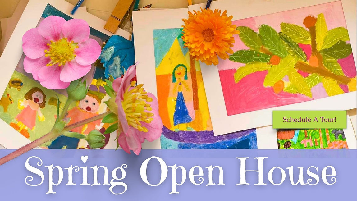
Shepherd's Flock Preschool
Capturing the vibrance of preschool life was key to bringing the brand to life—and that meant being intentional with every image. We prioritized photography that showcased real moments: curious kids exploring, laughing, learning, and connecting. These visuals do more than fill space—they tell a story that resonates emotionally with parents. Bright, natural lighting, expressive faces, and candid movement helped us mirror the energy of the classroom while building trust through authenticity. It’s not just about looking cute (though, yes, the adorable factor is high)—it’s about showing families exactly what makes this preschool experience special, warm, and full of life.

This 2017 preschool rebrand was all about trading drab for delightful. The old website felt outdated and hard to navigate—definitely not the first impression today’s young moms are looking for. So enter bright, welcoming visuals, modern typography, and an intuitive layout that made finding key info (like enrollment, curriculum, or contact details) a breeze. Every design choice was made with the target audience in mind—millennial and Gen Z moms who value style and substance. A digital space was created that felt trustworthy, playful, and polished—just like the preschool experience itself.